Political, Campaign
The campaign needed a website that could inform and mobilize voters in a streamlined and accessible way.
3 Weeks
Full-Stack Designer
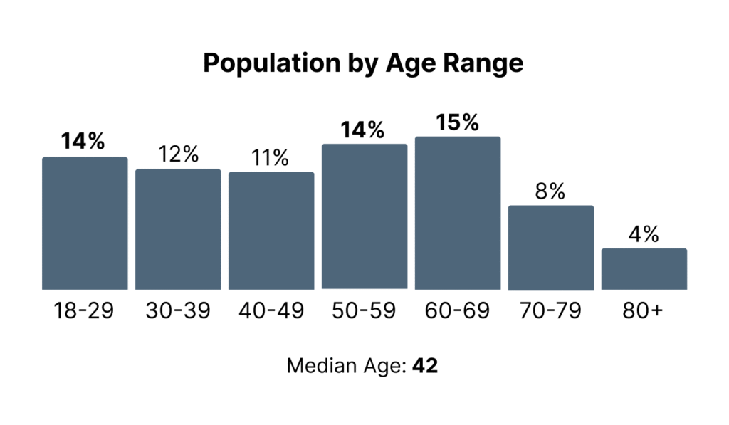
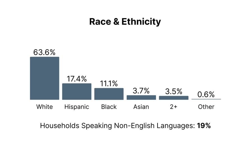
Beginning this project, it was important to analyze demographic groups in Winder’s district. That way I could identify the types of users that would be interacting with the site, and ascertain what their needs would be.
To achieve this, I researched demographic information for Winder’s district (NJ-02), and combed through census data to ensure the information was relevant to our target audience of eligible voters.


Once the data was compiled, I created several personas to present an easy-to-understand representation of the potential user base. The results yielded a need for a website that was friendly to an older age range which may not be frequent web users. They also presented a need for site language that could be easily translated and understood by ESL users, which made up 19% of households in the district.
With goals identified and a solid foundation of target audience formed, the last step of my research was competition analysis. I evaluated the incumbent’s website who Winder would be running against, finding areas where Winder’s site could surpass it in overall user experience.
The incumbent’s site lacked in navigational ease and information sorting, so I planned for Winder’s site to excel in those areas.
I began the ideation process with sketches. Using the Crazy 8s Method, I was able to hammer out my best information sorting options for pages like ‘In the Community’ and ‘Events’ which were highlighted as important for our personas. Selecting the best of what I sketched, I moved on to building low-fidelity wireframes in Figma to organize my work.
Delving into deeper design, I started by prototyping from the high-fidelity wireframes that I made. The prototypes were client facing, so I wanted to make sure that the they flowed as seemlessly when presented.
Winder’s team provided critiques on the design, but opted for them to be made in the build process rather than additional editing rounds due to campaign time constraints. As such, it was time for me to build the website.
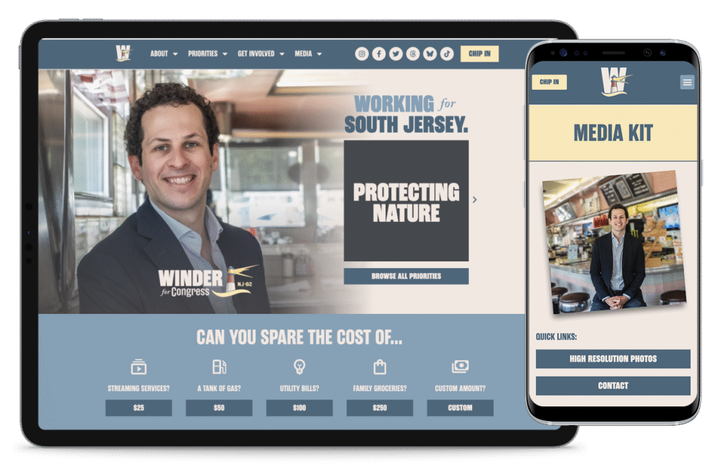
The build was carried out using wordpress with additional design plugins, CSS, and HTML. The site did have some key differences compared to its initial ideation, but still met the goals outlined in the research phase overall. Thus, I believe the build yielded a solid final product.
Looking back at the original goals for the site, I believe the project was successful at achieving intelligible information sorting, navigational ease, and cultivating a down-to-earth feeling to match Bayly’s campaign.
One place where I the project was more difficult to work around, though, accessibility, especially for ESL users. While I suggested to get a translation pluggin for the site, that idea was unfortunately not adopted and as such could not be implemented in the final version. As a result, we instead used language that was at a comprehensible reading level for basic understanding and third-party translation to accommodate ESL users.
What I learned from this process was that although specific suggestions may be vetoed during the design process, it is still possible to push for and achieve a desired outcome if you can take the extra time to ideate more potential solutions. Good UX does not need to be sacrificed for client satisfaction. Rather, it’s the job of a designer to find new paths that can meet user’s needs while also respecting stakeholder’s requests for the project.