
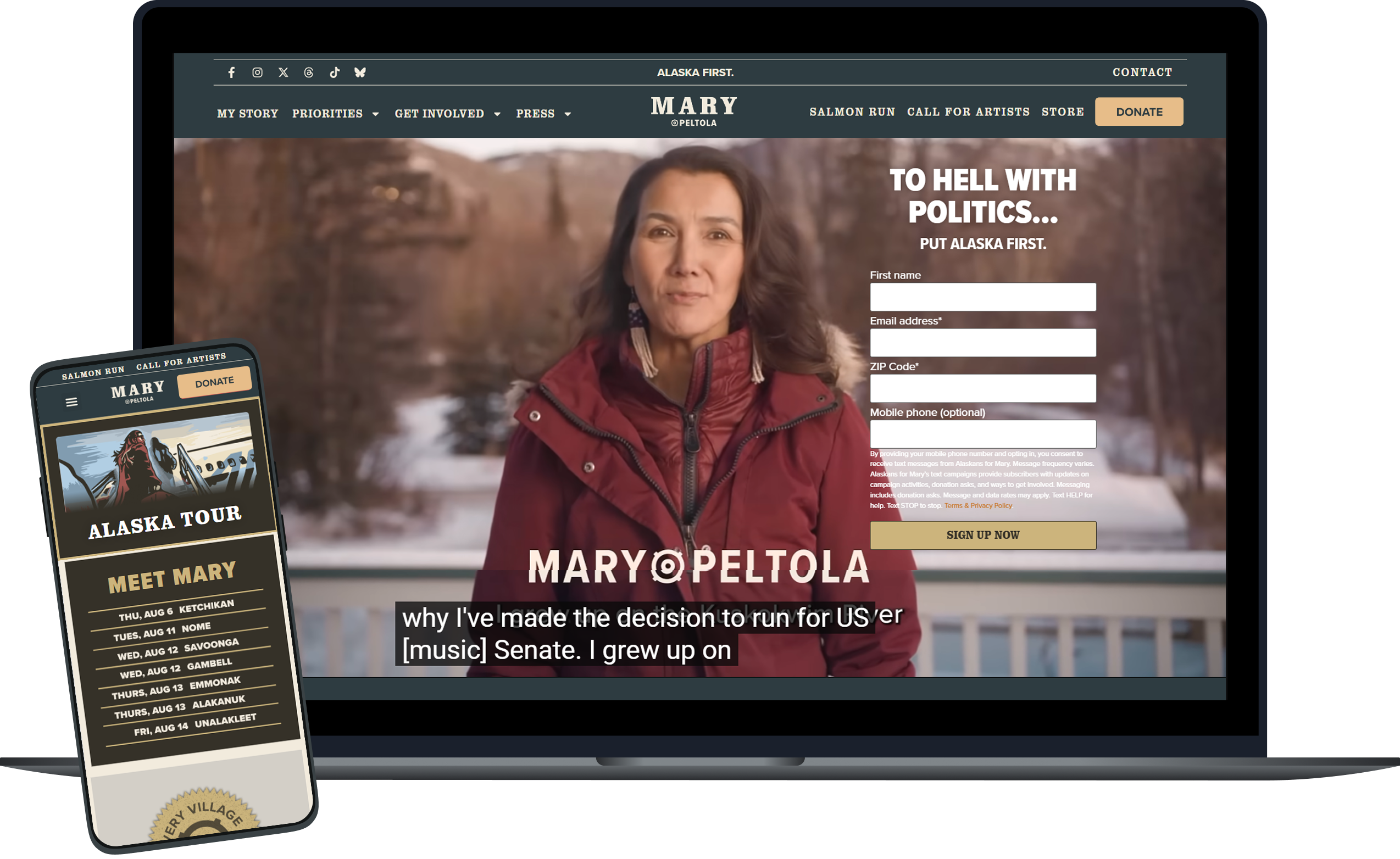
MARY PELTOLA FOR SENATE
Campaign Website
Mary Peltola is a Democrat running for US Senate in Alaska. With the political climate of Alaska in mind, I designed her website to read less ‘traditional democrat’. Peltola’s site is based on outdoors/hunting brands common for Alaskans to make it approachable to voters belonging to any party.
Role
UX Designer & Front-End Developer
Scope
Designing a US Senate campaign website, including setting up and its design system and building the site.
Platform
Figma, WordPress, Elementor
PROBLEM
Design for two very different political audiences
The site had to be designed for both progressive voters and independent-minded conservatives without either audience feeling like the content wasn’t built for them.
Approachable Across the Aisle
Alaska is not a state where a campaign site can look like a typical national Democratic property and expect to win. Many of the voters are instinctively wary of "DC politics" and party branding of any kind.
Older & rural readership
Larger type, high contrast, and simple navigation were essential for users to consume the content of the site.
Encompassing Design System
Between events, tours, merch drops, and even an art contest, the web design system had to support a constant stream of new campaign content without ever feeling off-brand.
Role & Goals
An Accessible Site That's Built to Grow
I designed and built the full website for Mary Peltola and created a design system that allowed for its continual upkeep by the campaign after handoff. The site was built with intentionality to users needs and pain points, using google analytics of her previous site and polling data as a research basis.
01 — Capture interest
Leading with the Campaign Narrative
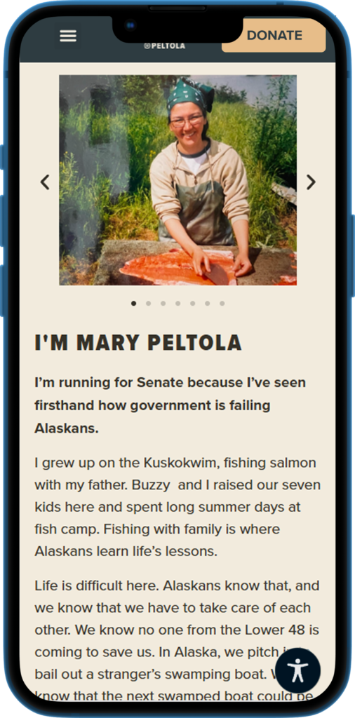
The homepage and overall site build were structured to build a personal Alaskan narrative for Mary that could attract voters. Mary’s story was prioritized on the page over merch, for example, because the goal was to secure votes, not sales.
02 — Persuade
A website that can swing votes
The website was designed to appeal to swing voters in a traditionally red state. The site needed to avoid things like traditional democrat blue that might turn users off before they consumed the site’s content.
03 — Mobilize
Make showing up feel like showing up
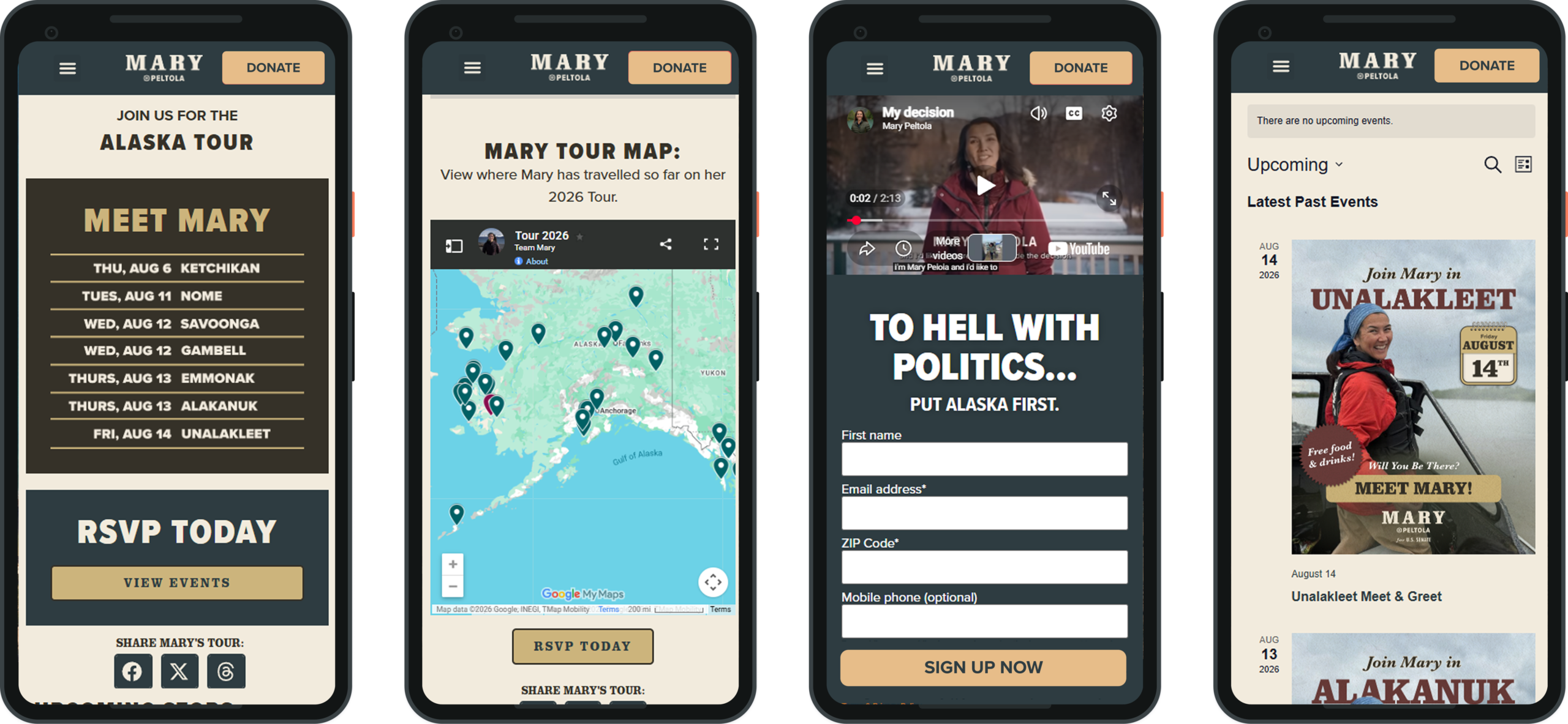
Events were branded as the “Alaska Tour”, which involved local village events with their own poster-style flyers, rather than just a generic events calendar, boosting turnout.
SOLUTION: crutial accessibility measures
Fully Accessible infrastructure
Many of the users were older, lived in rural areas, and did not have much web usage experience.
Larger base type, strong color contrast against the cream and forest green backgrounds, and a shallow, predictable navigation were essential for an older, rural audience to be able to engage with the site.
User recognition was prioritized for the same reason. Every major page repeats event signup, donations, and get involved ctas in the same visual pattern, so returning visitors never have to relearn how to support the campaign.
Solution: Information Architecture
Story first, priorities second, party affiliation deprioritized
The primary navigation is deliberately short only including My Story, Priorities, Get Involved, Press, Contact. The homepage builds campaign narrative while not explicitly labeling Mary as a democrat. This is afforded to the website due to a 99% name recognition of Mary Peltola by Alaskan voters, meaning users did not need web space to be taken up with introductions or direct party affiliation.
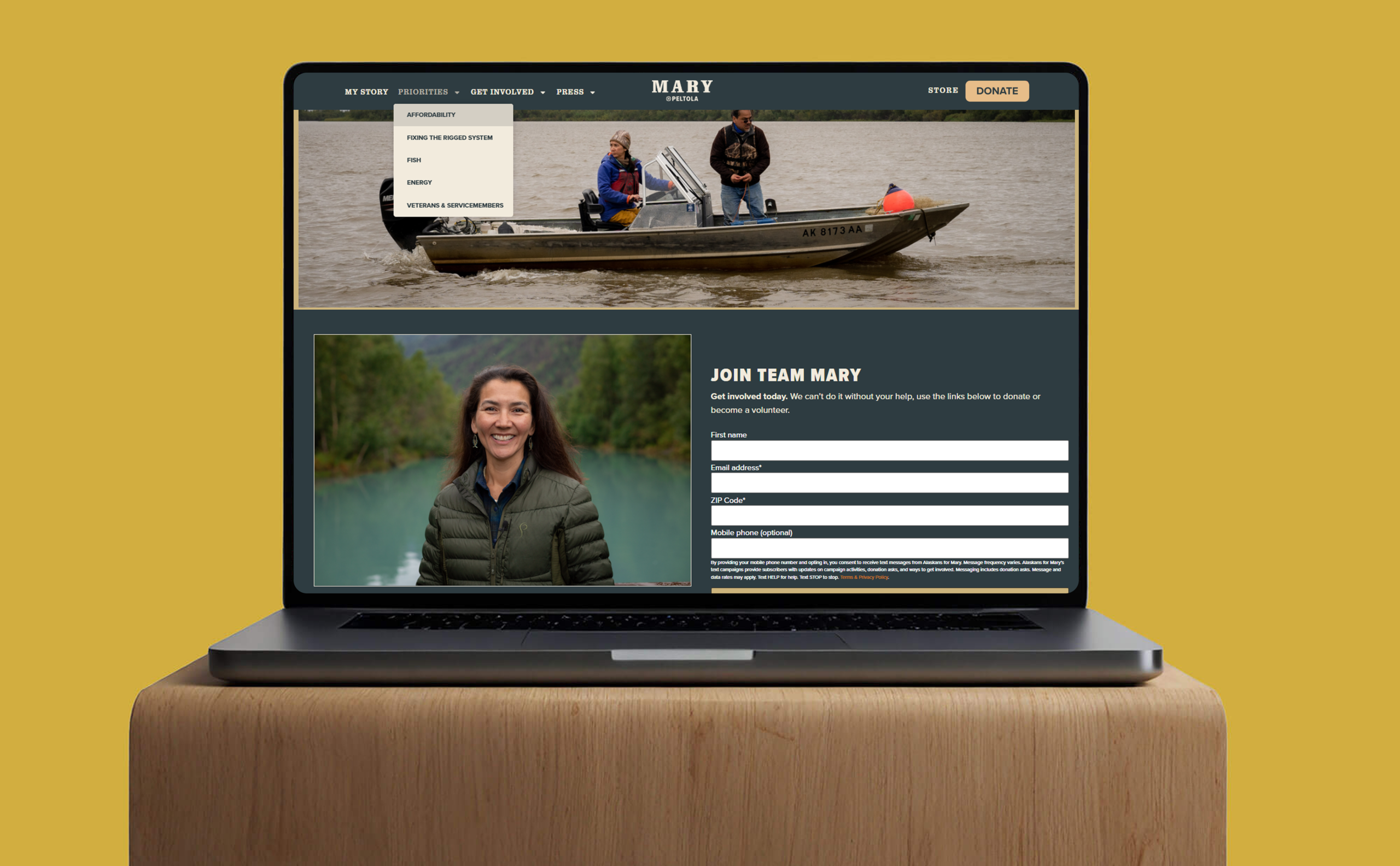
Outdoor imagery and visual language across the site does much of the persuation, positioning Mary as a down-to-earth Alaskan before users get to reading policy information.
Solution: design system
Easily replicable design
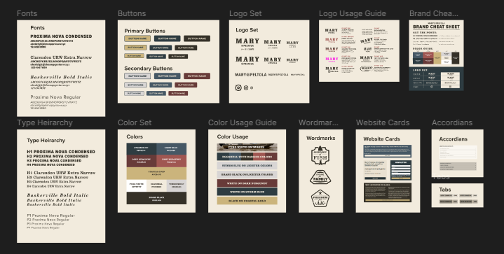
Campaigns move fast and outlive a single designer’s work. New tour stop pages, press hits, and policy posts all needed to ship on brand without them needing to come back to me. As such, I built a comprehensive design system in both Elementor and Figma that the campaign could use to maintain the site after handoff.
Solution: pushing voter turnout
Designing for turnout & traffic
A campaign site’s job isn’t just pageviews, it’s getting users to attend events, volunteer, and vote. I pushed frequent mobilization touchpoints on the site to increase turnout across the board. Newsletters, volunteer forms, and event signups were prioritized across the homepage and pushed at the bottom of all subpages.
Challenges & Tradeoffs
I Designed With These Challenges In Mind
Balancing Alaska aesthetic with Democratic values
Leaning too hard into hunting-brand visual language would risk feeling inauthentic to Mary’s Alaskan base. But it was important to steer clear of the traditional democrat design style. The web build was tuned through several rounds of edits to get to its strong final product.
Unconventional research process
Polling data replaced moderated usability sessions with our target audience of independent voters. I supplemented this with heuristic evaluation using Neilsen’s credibility and trust heuristics, and rapid feedback loops from on the ground voters. The site’s effectiveness was validated against the primary election results.
Designing for accessibility needs
The site was designed to accommodate an older user base with larger text sizes, high color contrast, simple navigation, and clear labels. On top of that enhanced base web usability, an accessibility overlay was added to allow fine-tuned accomodations.
Keeping components consistent
Keeping IA and components consistent after handoff was an essential consideration during my design. Projects needed to share a component vocabulary while being updated by non-designers under campaign deadline pressure.
Impact
What shipped
Mary Peltola won her primary and is projected to remain competitive heading into the general. Contributing to that win was her campaign site, built specifically to hold her base and persuade independent-minded voters at the same time.
Reflection
What I learned for my next project
A design system is a mobilization asset
Because staff could safely reuse components under real time pressure, design consistency could be maintained with every fast campaign deadline.
Prioritizing accessibility is non-negotiable
Every choice that made the site easier to read for older voters like contrast, type scale, shallow nav, and low page weight, were also design choices that kept users engaged on the site.
Don't be afraid to pull from your UX toolbox
Without formal user testing, I decided to use methods like heuristic evaluation and card sorting with the design team, pulling from what I learned in my Masters program. While these aren't replacements for usability testing, they did help to improve the site's UX before launch.